.

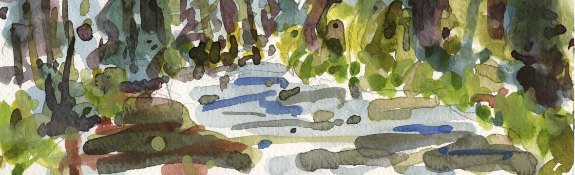
The thing that drew me to this scene was the circular hole formed by the traffic ramps, and, of course the power lines. I like the patterns created in the sky by power lines.
I was also reminded of this painting by Laine Bennion on his blog Studies in Oil. I like how Laine simplifies a scene and, although I’m satisfied with this painting, I think it could stand more simplification.
I often think, as I finish a painting, that, for the next one, I’m just going to slam it out and not fuss with it at all. That’s how I started on this one, in fact, I taped a larger piece of canvas to a board and started into it. When I felt myself starting to bog down in the details, I started it again in another corner of the same piece of canvas. This is the result of the restart, but it’s still a lot more fussy than I wanted it to be. Of course the subject is kind of busy but all the more reason to simplify it further.
.

I’ve been following your blog for a while, but this picture is so good I cannot refrain from telling you so. The subject and use of colours is stunning.
LikeLike
This is beautiful!
LikeLike
Rene, Thank you very much. I enjoyed visiting your blog. You do beautiful work.
Lucie, I appreciate your comment. Your paintings are really wonderful.
LikeLike
I really like your city scapes. Whenever I think of painting one, I worry about getting the lines just right with just the right curve and thickness. But you paint them in such an appealing way I can see perfection is not necessary to a very good painting.
LikeLike
Hi Bill!
Thanks for visiting my blog.
I like your looseness of painting and in this one the color scheme is quite wonderful. Also the composition where you draw the viewer into the painting.
Cheers from Vienna.
Nue
LikeLike
BTW, would you mind correcting my name on your link list? 😉 Nuetzel, in German it is written Nützel.
LikeLike
Bill, It’s a very good thing that perfection is not necessary to produce a decent painting, don’t you agree? Thanks for the continued encouragement.
Hi Stefan, I apologize for the misspelling, it’s fixed now. I wish I had an umlaut on my keyboard. I appreciate your comment, I always look forward to visiting your blog.
LikeLike
Bill- you did keep it loose and simple by your excellent color usage. This one looks as though it poured right off your brush. It’s just wonderful. That looseness is often ” e-loose-ive “!
My goal too.
LikeLike
It’s amazing how nice this painting looks…. The subject would probably not inspire most people, but you’ve managed to make it look very appealing! It’s a gift… savore it!
I LOVE Bonnie’s word…. e-loose-ive…. perfect!!
LikeLike
Bonnie, I’m glad the struggle doesn’t show. It’s funny how much work it takes to make something look like it didn’t take much work.
Marian, I’m really drawn to urban/industrial scenes. I’m glad you like it.
Yes, Bonnie is a gem 🙂
LikeLike
This is friggin GOOD!!
LikeLike
Hi Ambera, Long time no hear. I’m loving the prints you’ve been doing.
LikeLike
I am always amazed by the way you work overhead wires and poles into
the design–you and Paul Hogarth in his CREATIVE INK DRAWINGS! And I
always like your palette.
annie
LikeLike
verrrrrrry cool!
LikeLike
This one is real special Bill. You’ve simplified a complex design and made it work. The colors are perfect.
LikeLike
This painting has that quality of mirage, of heat from asphalt bending light, if you get my drift. Not upon close-up, of course, but viewed as it should be viewed. I like this one particularly.
LikeLike
Hi Annie, It’s really nice to hear from you. Thanks for the kind words. I’m not aware of Paul Hogarth, I’ll have to look him up.
Thanks Celeste!
Hi Frank, I’m glad you like it.
Tina, interesting observation. In fact it was rather cold out but I think I know what you mean. Thanks for visiting.
LikeLike
Thank you for the reality check. What my loved ones have been telling me must be true. Time to set the denial aside and trade up the dollar store reading glasses for the real thing. First time viewing yesterday, look forward to coming back.
LikeLike
First time at your site and so very impressed… incredible work … you remind me of Gianni Cilfone from the midwest..
LikeLike
Thanks Diane and welcome. I was not aware of Gianni Cilfone. I’ll have to look him up.
LikeLike