.

10″ x 8″ oil on canvas
.
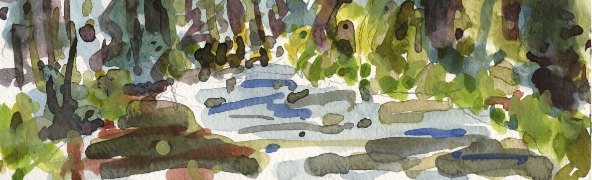
I was thinking a lot about using color or temperature changes to depict plane change rather than using white, in this painting.
I’ve added a few colors to my palette lately, partly out of boredom and partly because it seems wasteful to buy more paint before I used up what I have.
The bridge was painted with a color called perylene red. It’s described as a transparent, cool red with yellow undertones. I’m not sure how a red with yellow undertones can be considered cool but temperature is relative. I’ve also added cad orange for mixing greys. I’m using cobalt blue some, in addition to ultramarine and pthalo. Mixing the cobalt blue with perylene red made some interesting shadow colors for the bridge. I’ve added indian yellow to my normal cad lemon and cad yellow medium for a change as well.
My current palette is Tit white, Cad Lemon, Cad Yellow Med, Indian Yellow, Cad Orange, Cad Red Med, Aliz Crimson, Burnt Sienna, Cobalt Blue, Ult Blue, Pthalo Blue, Sap Green and Ivory Black. I’ve been switching back and forth from titanium white to flake white replacement. The flake has more body and makes the paint stickier. I’d say that I used primarily perylene red, ult, pthalo and cobalt blues, cad lemon, and titanium white on this one. Adding colors to my palette doesn’t necessarily mean I’ll use them but I’m lazy and once color runs out on the palette, I tend to grab another color that’s already out rather than squeeze fresh paint from the tube. Sometimes laziness pays off.

…I like it, Bill…but I never would have guessed your palette from the painting.. LOL ! Good impression IMHO!
LikeLike
Bill — I really enjoy coming by and checking out your work. This one has such strong saturations and warm-cool interplay… it has a lot of depth. I was really taken by the energy in the drawing that went into 1st and Everett, too. But also the muted colors, with unexpected choices (like the brick color on the foreground).
LikeLike
I use all the colours you do, except for that perylene red which I don’t know. will have to try it. I also go through stages where I get a bit bored with my palette and then run off to buy new ones. In the end I always go back to the trusted ones, maybe add one here or there… Your bridge looks great…I especially love what you did with the water!
Ronell
LikeLike
great palette!
LikeLike
Parts of the bridge do look very warm and parts look cool. Whatever you painted with it worked pretty good.
LikeLike
suffering from the same “must use colors you already have” syndrome I started mixing viridian green with transparent red oxide for a transparent cool gray, and adding Daniel Smith’s light blue violet creates a lighter, more opaque version. I was very happy to discover a use for the light blue violet, which is such an awkward color it’s difficult to use effectively by itself. And I have a huge tube of it! Had it for several years, too. From my “heavily influenced by Wold Kahn” days. Ah…those were fun.
Have a joyous holiday season. Love the bridge and street paintings, but also that little still life.
LikeLike
Hi Bill, wanted to come by and wish you happy holidays. Remember recommending the book, Has Modernism Failed? Excellent read. I recommended it to Edgar (who posted a comment five people above me) and though he is still reading it has written an interesting review.
p.s. love the effect of the sunlight hitting parts of the red bridge.
LikeLike
Thanks everyone for stopping by. I’ve been pretty busy with a sick family member and the unusual snow storm that’s paralyzed Portland over the last week and a half.
Happy Holidays to you all. I really appreciate your kind remarks.
LikeLike